Analysis
This project is mostly an exploration and explication of the data sets and transformation, so what follows is only a brief analysis. I’ll start with taking a further out perspective on the data, looking at the 25 most common labels applied to base image set and the lower resolution image set. I produced the following bar charts in Tableau.
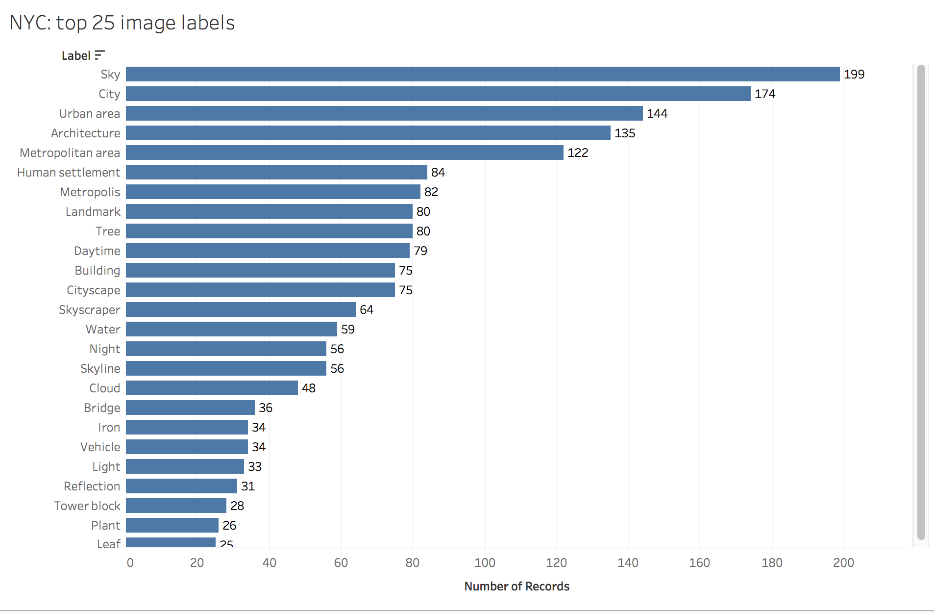
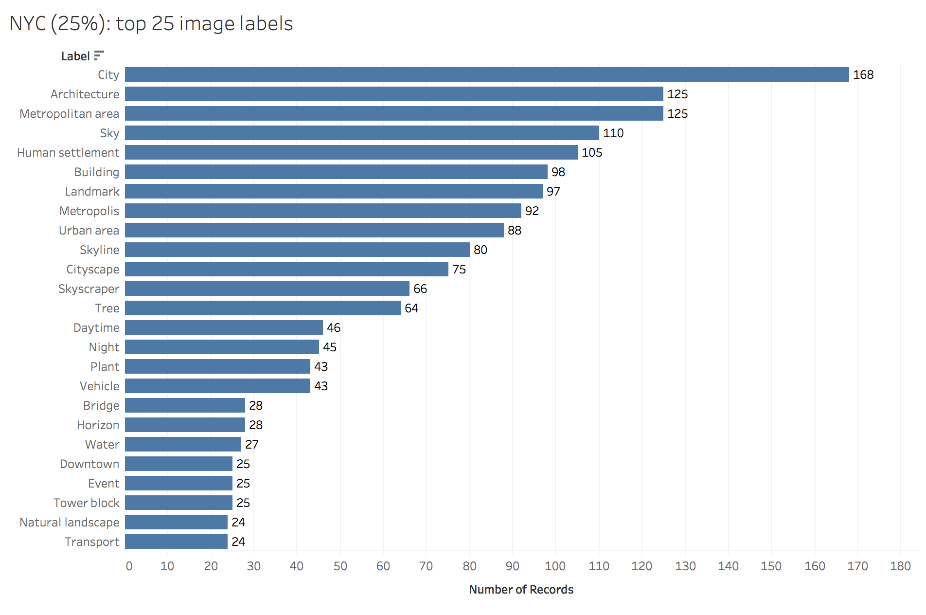
Absences in data carry their own meaning, and the human perspective better sees these absences. The first thing I wonder is, where are the people? These images are being created by the government of the most populous city in the USA, and yet infrastructure and the built environment make up the vast majority of the labels for both the base image set and the reduced-size image set. Only the label Event, 22nd most common in the reduced-size image set, points to the presence of citizens themselves.
Reducing image size shrinks the heavens. “Sky” was the most common label applied to the full-size images (n=199), but only 110 of the reduced-size images were labeled with “Sky”. Potential vagaries in the training data are evidenced by differential applications of the seemingly overlapping labels “Metropolitan area”, “Urban area” and “Human settlement”, or perhaps this reflects a controlled vocabulary. It is difficult if not impossible to determine that without knowing how the training images were categorized. “Metropolitan area” was applied roughly equally (122 full size vs 125 reduced), whereas “Urban area” was predominantly a label applied to full size images (144 full size vs 88 reduced), and “Human settlement” predominantly given to reduced-size images (84 full size vs 105 reduced). It’s hard to discern the meaning behind labels at this scale, so I decided to focus on a closer reading of the data.
There were labels that were applied to the full size image set which were not applied to the reduced-size image set and vice versa. I identified the 37 images that contained at least one unique label for the full-size version as well as at least one unique label for the reduced-size version. I focused on these for a closer look. A sample of the results are shown below.
Let’s start with a miss…
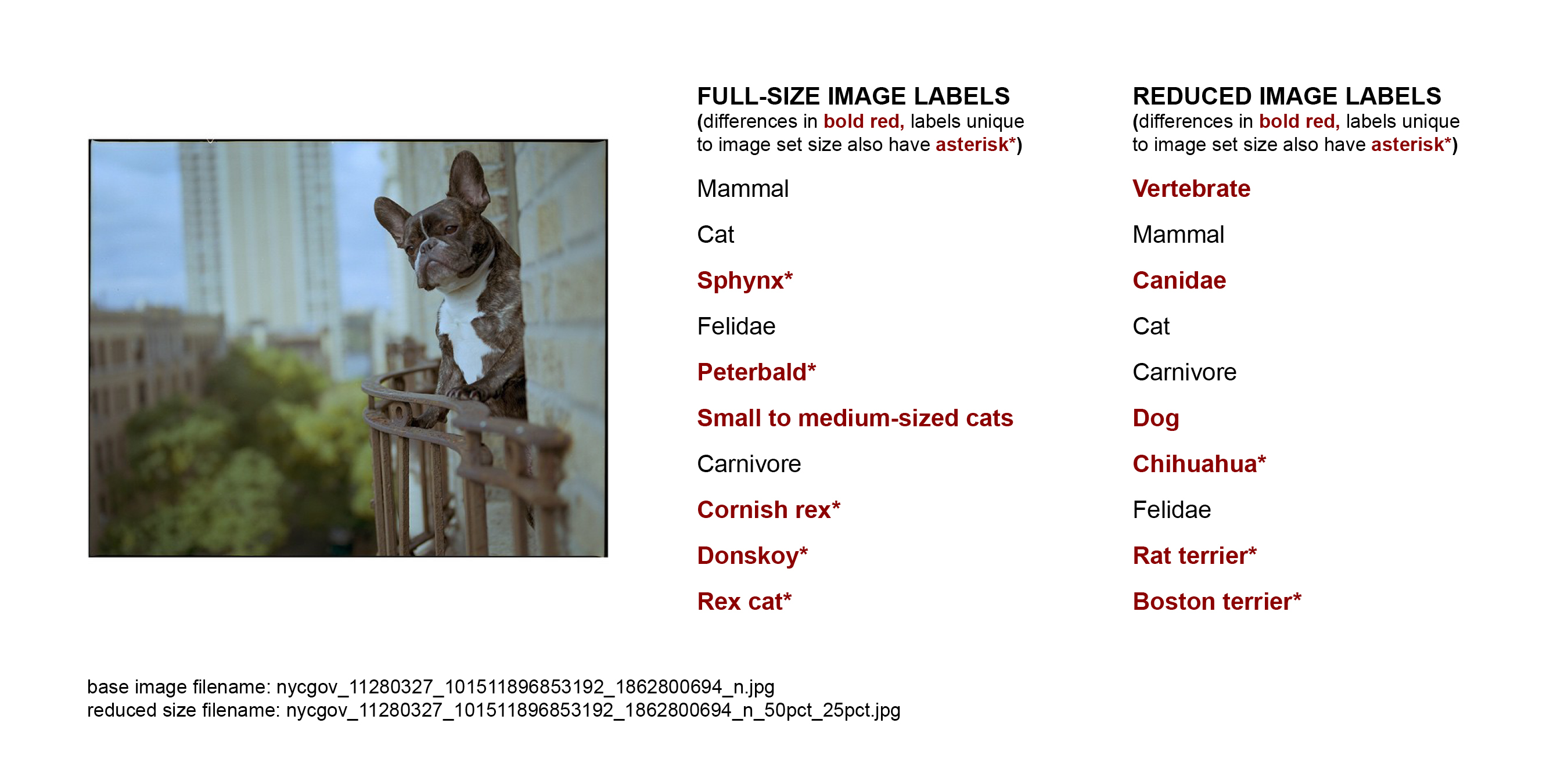
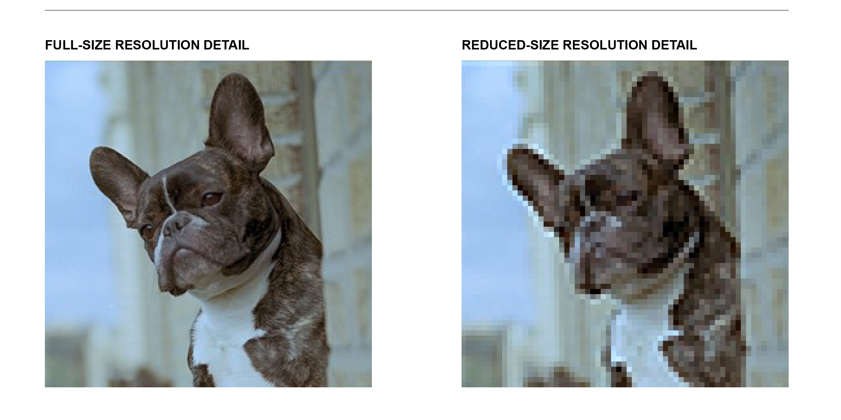
Google Cloud Vision was significantly better at identifying this dog in the lower-resolution, reduced-size version of the image. At full resolution, when more detail was available, most of the labels were cat-related. There are highly specific types of cats in the labels, including some I’ve never heard of (Peterbald, Donskoy) pointing to an interesting specificity in the training data. Sky, City, Architecture, Building, and Tree were among the most common labels for the image set as a whole, but despite all those appearing here none of them were labeled. All of the labels here applied to the in-focus subject of the photograph.
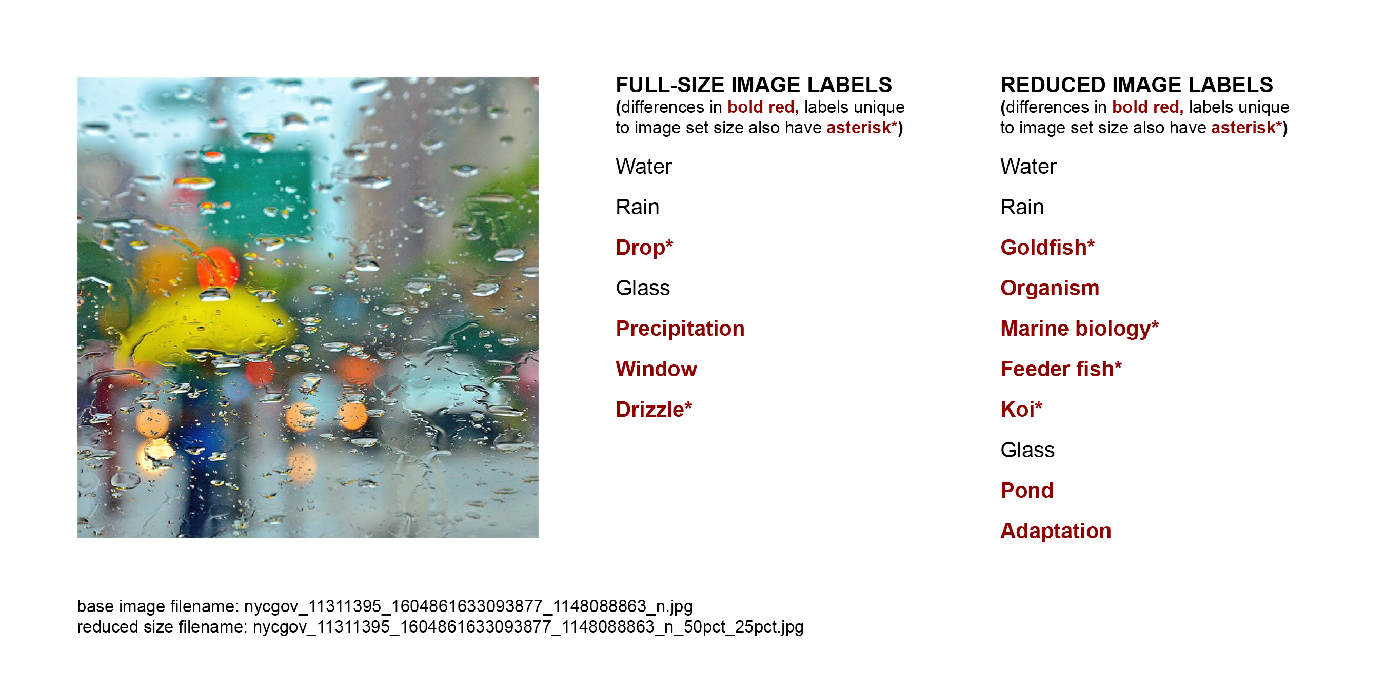
Unlike the first example, here the labels were more accurate for the full-resolution image. At reduced-size the AI interpreted the colorful blobs (presumably) as fish. One mystery here is the label adaptation. I’m not sure to what that refers, or even how adaptation would exist as a discretely identifiable content category.
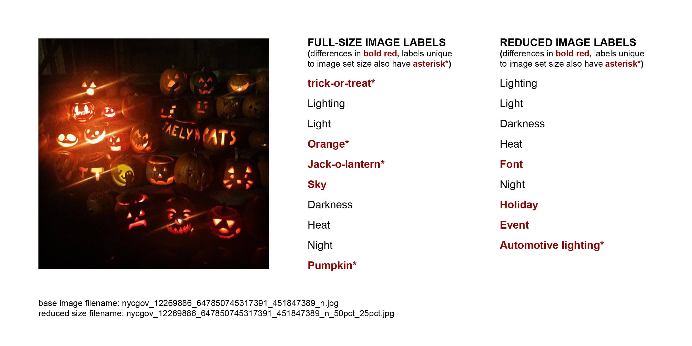
Here again the labels are more accurate for the full-size image and more specific to the Halloween content (trick-or-treat, Jack-o-lantern, Pumpkin). At reduced size, blurring the lit up pumpkins made them mistakable for general festive lights (Holiday) or the rear lights of a car, perhaps (Automotive lighting).
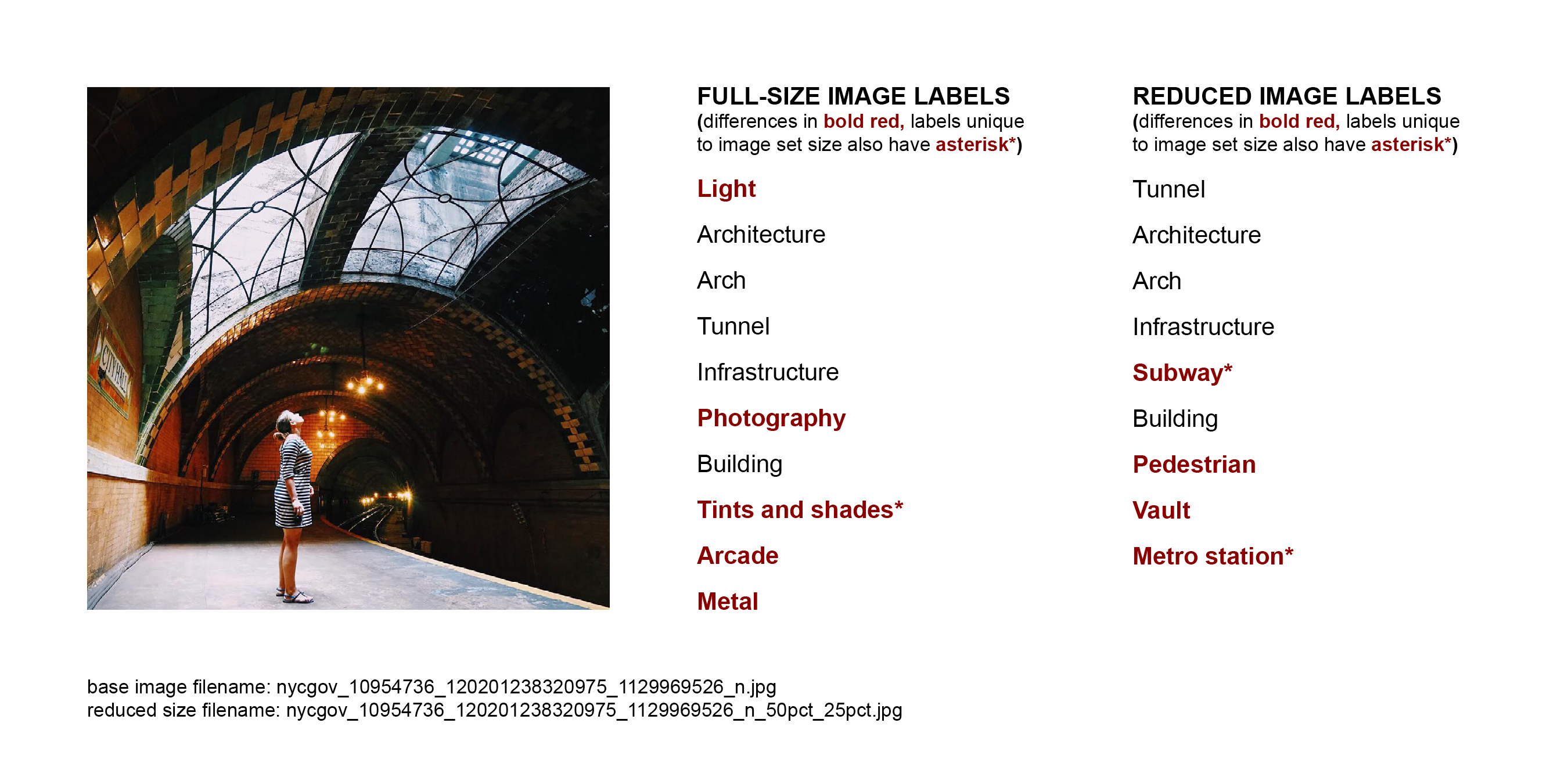
In this image the person seems central to my human eyes, but she only appears (Pedestrian) in the reduced-size labels. At full size, the AI focuses on the built environment, and Tints and shades.
CLICK HERE TO SEE MORE IMAGES ALONGSIDE AI-GENERATED LABELS
Context and critique
All stages of all data used in this project are available for download from the TRIKE website. The data also contains a confidence rating for each label, which did not play into my analysis here but which you may wish to do something with in analyses of your own.
What I find most interesting is the scarcity of labels indicating people in the images from the New York City Instagram account. The New York City that Google Cloud Vision sees in these Instagram photos is a place of massive infrastructure yet few inhabitants. I plan to explore further in future work to what extent this is a function of subject presence, image composition, and the label choices made by the AI.
Continue on to statement of fair use…

This entry is licensed under a Creative Commons Attribution-NonCommercial-ShareAlike 4.0 International license.