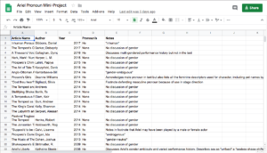
I decided to make a series of simple charts to visualize the data in order to make what I found interesting about it more easily recognizable. I, with some embarrassing slowness, realized that I was going to have to completely restructure my data in order to make it legible for charts. This is what my original spreadsheet looked like:
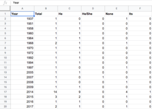
As I commented on earlier, this was great for my own personal note-taking, but isn’t legible to a computer to make a chart from. A friend helped me structure and break out my data (friends and search engines are invaluable resources!) This is the spreadsheet I ended up with for making my first two charts:
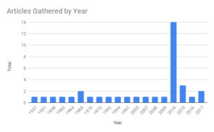
First, a chart showing the number of articles I was able to gather for every year. The huge spike in 2014 is significantly, although not entirely, due to several of the articles that I gathered being taken from one book published that year. I chose to include them as separate texts because they didn’t share an author. They do, however, share an editor, which could mean that there were stylebook rules in place for the pronouns being used for Ariel. However, the chapters I collected are not homogeneous in their pronoun use, and in fact include one of the two uses of a gender neutral pronoun. While this results in a comically proportioned graph, you can see from the second graph (below) that it did not cause any trends to be misrepresented, as the male pronouns are still significantly more represented in that year, followed by no pronoun use, and with one instance of a gender neutral pronoun.
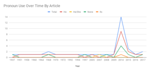
Next, a chart showing pronoun use over time.
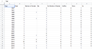
Then, I wanted to visualize how many articles had any discussion of Ariel’s gender over time. Here is the spreadsheet I used to make that chart:
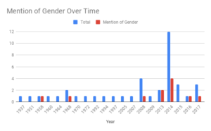
And here is the resulting chart. It can be seen clearly here that Ariel’s gender is being discussed increasingly as the years go on, albeit still inconsistently. You will notice I ended up not using a significant number of the columns on that chart. This is because there were so few articles that discussed Ariel’s gender that when those other categories were included, that information became overwhelmed by all the other data and difficult to read. Instead I added an additional chart at the end.
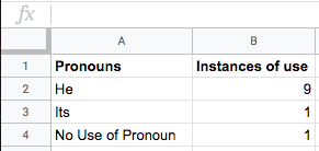
Finally, I made this table, which shows how many of the articles that discussed Ariel’s gender and fluidity still used male pronouns. I originally made this into a chart, but felt that the data was more accurately visualized in the bareness of the numbers.
Articles Including Gender Discussion: 11
Continue on to the next section…

This entry is licensed under a Creative Commons Attribution-NonCommercial-ShareAlike 4.0 International license.